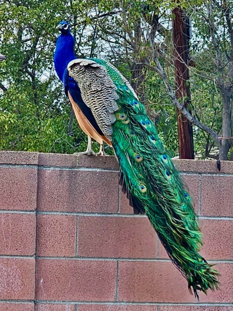
The power of print mixing is the ability to combine different patterns and prints to create a visually appealing outfit or even space. Anything visual as evidenced by the peacock can benefit from a little mixing it up. As I am a huge advocate of color, print mixing is next level and, in my book, exudes confidence without fail. In the past, I have discussed color blocking, pops of color and wearing prints as well of stripes. This article is the next level, and following will be a starter kit for upping your game in the print mixing world and might even give new life to some old items you thought had exceeded their life span.
Okay let’s give it a whirl….
Starting with a classic print that is small, and evenly distributed: You can use a simple print like stripes. Be mindful of the scale meaning width of stripes and stripe lines, polka dots any size, or florals as a base.
Another consideration is texture. Once again, just be aware as we are aiming for a well-balanced look.
And finally, Color. If you are good with color, go for it. Use your best color blocking options. If not, err on the side of caution and use the same family of colors and vary the shades.
Mixing prints is a fun way to elevate your outfit and showcase your personal style. Understanding color harmony and balancing print sizes are key elements in mastering the art of mixing prints. Floral patterns are a timeless choice for print mixing, while geometric shapes add a more contemporary twist.
- It might take a little getting used to, but go ahead and layer on a bolder print: Pair a classic striped shirt with a geometric pattern. Rule of thumb> skinny stripes are best offset by a larger geometric pattern and vice versa parity is not the goal confident pairing is.
- Mix patterns of different sizes: Pair a small-scale print with a large-scale pattern.
- Use color: Use bold patterns in neutral colors like black and white to offset more vibrant patterns with lots of colors.
- Clash patterns: Mix bold patterns like leopard print and plaid, and anchor the look with a neutral toned item or my favorite RED looks fabulous with animal prints. It has contrast and sparks the print to new levels. Truthfully, you can use any jewel tone if you are bold. Or go with a softer tone like taupe, brown or white. You can never go wrong with a crisp white anything to set off the look.
- Pair loud and minimal prints: Pair loud prints with their thin, minimal counterparts.
Print mixing has unlimited options! Go and dig through your wardrobe, bring out the scarf from Aunt Mary, the handbag from your college days, hats, belts you name it. Be creative, go wild…. you might just have fun in the process.
As always, I recommend you Dress for the day you want – NOT the day you are given. Dressing is fun. Enjoy.
Be well, Be Stylish, Be Kind as you Glow with me!